Adding Tabs in TabPanel
There are two ways to define tabs in the TabPanel control, one using markup and other through code. Please see the sections below to know more about the two ways.
By default, first tab of the TabPanel control is selected on intial display. However, to display any other tab in selected state while loading initially, you can use wj-stat-active class in markup or intialize the selectedIndex property in JavaScript.
Using Markup
The markup used to initialize the TabPanel control consists of one DIV element per tab, each with two children: the tab header and the tab content. It is recommended to use anchor elements (tag a) for the tab headers because they are semantically more meaningful than plain div elements.
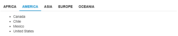
The example below creates a TabPanel with five tabs and each tab displays a list of country names using the unordered HTML list. The class wj-state-active has been set on "America" tab to display it as selected on initial rendering.
HTML
 <div id="theTabPanel">
    <div>
      <a>Africa</a>
      <div>
        <ul>
          <li>Algeria</li>
          <li>Angola</li>
          <li>Benin</li>
          <li>Botswana</li>
        </ul>
      </div>
    </div>
    <div>
      <a class="wj-state-active">
            America
        </a>
      <div>
        <ul>
          <li>Canada</li>
          <li>Chile</li>
          <li>Mexico</li>
          <li>United States</li>
        </ul>
      </div>
    </div>
    <div>
      <a>Asia</a>
      <div>
        <ul>
          <li>China</li>
          <li>Korea</li>
          <li>India</li>
          <li>Japan</li>
        </ul>
      </div>
    </div>
    <div>
      <a>Europe</a>
      <div>
        <ul>
          <li>Austria</li>
          <li>England</li>
          <li>France</li>
          <li>Germany</li>
          <li>Netherlands</li>
          <li>Switzerland</li>
        </ul>
      </div>
    </div>
    <div>
      <a>Oceania</a>
      <div>
        <ul>
          <li>Australia</li>
          <li>Fiji</li>
          <li>New Zealand</li>
          <li>Samoa</li>
        </ul>
      </div>
    </div>
  </div>
Javascript
import * as wjNav from '@grapecity/wijmo.nav';

function init() {
  new wjNav.TabPanel('#theTabPanel', {
  });
}
Using Code
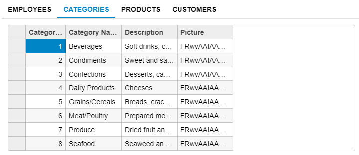
In some cases, there might be a need to add tabs to a TabPanel control programmatically rather than using HTML markup. The tabs property of the TabPanel control provides access to the collection of tabs in the TabPanel and can be used to add, remove, modify, or reorder the tabs within the TabPanel.
The code snippet below creates the same TabPanel using code, rather than markup and sets the second tab to be selected on initial rendering by setting the selectedIndex property of TabPanel control to value 1.
HTML
 <div id="theTabPanel">
 </div>
Javascript
import * as wjNav from '@grapecity/wijmo.nav';
import * as wjGrid from '@grapecity/wijmo.grid';
import * as wjOData from '@grapecity/wijmo.odata';

function init() {
    var theTabPanel = new wjNav.TabPanel('#theTabPanel'), url = 'https://services.odata.org/Northwind/Northwind.svc/', headers = 'Employees,Categories,Products,Customers'.split(',');

    theTabPanel.tabs.deferUpdate(function () {
        headers.forEach(function (header) {
            // create the tab header element
            var elHeader = document.createElement('a');
            elHeader.textContent = header;
            // create the tab pane element
            var elPane = document.createElement('div'), elGrid = document.createElement('div'), theGrid = new wjGrid.FlexGrid(elGrid, {
                isReadOnly: true,
                itemsSource: new wjOData.ODataCollectionView(url, header)
            });
            elPane.appendChild(elGrid);
            // add the new Tab to the TabPanel
            theTabPanel.tabs.push(new wjNav.Tab(elHeader, elPane));
        });
    });
    // select the first tab
    theTabPanel.selectedIndex = 0;
}