MultiRow Layout Definition
The MultiRow control extends conventional grid layouts by using multiple rows to represent each data item.
The MultiRow control allows users to see and edit data in a tabular form, just like other conventional grids. But, MultiRow is different from these grids in a way that it allows you to bind each data item to multiple rows, creating form-like interfaces that can display a large number of columns with minimal horizontal scrolling.
The MultiRow control extends the FlexGrid control, so if you know how to use FlexGrid, you will be able to use MultiRow in no time. The main new property is layoutDefinition, which takes an object that describes the layout of the grid rows and cells.
The MultiRow control is not a simple replacement for conventional grids; it is a specialized tool that fits some particular scenarios really well.
To use the MultiRow control in your applications, add references to the wijmo, wijmo.grid, and wijmo.grid.multirow modules, then instantiate MultiRow controls by giving them host element on the page.
The layoutDefinition property specifies the layout of the cells in the grid. It contains an array of cell group objects. Each cell group specifies how many columns the group should span, and the cells that make up each group.
The image below illustrates how a cell group is interpreted and turned into a grid layout:
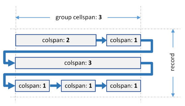 The group spans three grid columns. It contains six cells with different spans. When generating the layout, the grid fits as many cells as possible in each row, and wraps to the next row when the group span is reached. The last cell in each row is automatically expanded to fill colspan of the group. The process is similar to wrapping of text to create a paragraph.
The same process is applied to every group in the layoutDefinition object.
Code Example
import * as wjMultiRow from '@grapecity/wijmo.grid.multirow';

var multirow = new wjMultiRow.MultiRow('#multirow', {
    itemsSource: appData.orders,
    layoutDefinition: [
        {
            header: 'Order', colspan: 2, cells: [
                { binding: 'id', header: 'ID', colspan: 2, cssClass: 'id' },
                { binding: 'amount', header: 'Amount', format: 'c', colspan: 2, cssClass: 'amount' },
                { binding: 'date', header: 'Ordered' },
                { binding: 'shippedDate', header: 'Shipped' }
            ]
        },
        {
            header: 'Customer', colspan: 3, cells: [
                { binding: 'customer.name', header: 'Name' },
                { binding: 'customer.email', header: 'EMail', colspan: 2, cssClass: 'email' },
                { binding: 'customer.address', header: 'Address', colspan: 2 },
                { binding: 'customer.phone', header: 'Phone' },
                { binding: 'customer.city', header: 'City', dataMap: cityMap },
                { binding: 'customer.state', header: 'State', width: 45 },
                { binding: 'customer.zip', header: 'Zip' },
            ]
        },
        {
            header: 'Shipper', cells: [
                { binding: 'shipper.name', header: 'Shipper' },
                { binding: 'shipper.email', header: 'EMail', cssClass: 'email' },
                { binding: 'shipper.express', header: 'Express' }
            ]
        }
    ]
});