Pie Charts with FlexPie
This topic includes features unique to the FlexPie control. FlexPie shares most of the same API and featureset with FlexChart.
FlexPie Data Binding
The data binding for Sunburst is slightly different than FlexChart.
The binding property is used to calculate the size of the slice. The property should contain numeric data.
The bindingName property is used to show name of the slice. It should be a string.
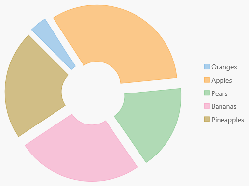
Basic Pie Features
The FlexPie control has five basic properties that allow you to customize its layout and appearance:
- innerRadius: Specifies the control's inner radius to support donut charts.
- offset: Specifies the offset of the pie slices from the center of the control.
- startAngle: Starting at the nine o'clock position, specifies the angle to start drawing pie slices.
- palette: Specifies an array of default colors to be used when rendering pie slices.
- reversed: Determines whether the control should draw pie slices clockwise (false) or counterclockwise (true).
Example:
import * as chart from '@grapecity/wijmo.chart';

var myChart = new chart.FlexPie('#myChart', {
    binding: 'value',
    bindingName: 'name',
    itemsSource: getData(),
    innerRadius: 0.3,
    offset: 0.1,
    startAngle: 45,
    reversed: false,
    palette = wijmo.chart.Palettes['standard']
});
Selection
The FlexPie control allows you to select data points by clicking or touching a pie slice. Use the selectionMode property to specify whether you want to allow selection by data point or no selection at all (default).
Setting the selctionMode property to Point causes the FlexPie to update the selection property when the user clicks on a pie slice, and to apply the "wj-state-selected" class to the selected element. Setting the FlexPie's selectionMode property to Series or None will disable selections within the control.
The FlexPie offers three additional properties to customize the selection:
- selectedItemOffset: Specifies the offset of the selected pie slice from the center of the control.
- selectedItemPosition: Specifies the position of the selected pie slice. The available options are Top, Bottom, Left, Right, and None (default).
- isAnimated: Determines whether or not to animate the selection.
Example:
myChart.isAnimated = true;
myChart.selectionMode = 'Point';
myChart.selectedItemOffset = 0.2;
myChart.selectedItemPosition = 'Top';

See the Advanced Concepts/Selection topic for more.
Theming
The appearance of the FlexPie control is largely defined in CSS. In addition to the default theme, we include several professionally designed themes that customize the appearance of all Wijmo controls to achieve a consistent, attractive look.
You can customize the appearance of the FlexPie control using CSS. To do this, copy the CSS rules from the default theme to a new CSS file and modify the rules as needed.
In this example, we added the "custom-pie-chart" CSS class to the control and defined some CSS rules to change the fill, font family, and font weight of the header, footer, and legend.
<div id="themeChart" class="custom-pie-chart"></div>

/* pie with custom styling */
.custom-pie-chart.wj-flexpie .wj-header .wj-title,
.custom-pie-chart.wj-flexpie .wj-footer .wj-title,
.custom-pie-chart.wj-flexpie .wj-legend > .wj-label {
    fill: #666;
    font-family: 'Courier New', Courier, monospace;
    font-weight: bold;
}