MultiSelect Overview
The MultiSelect control allows users to select multiple items from drop-down lists that contain custom objects or simple strings. It extends the ComboBox control, with all the usual properties, including itemsSource and displayMemberPath.
Like the ListBox control, it has a checkedMemberPath property that defines the name of the property that determines whether an item is checked or not. The items currently checked (selected) can be obtained using the checkedItems property.
The control header is fully customizable. By default, it shows up to two items selected and the item count after that. This behavior can be customized using the following properties:
- maxHeaderItems: You can change the maximum number of items to display in the control header.
- placeholder: Change the message shown when no items are selected.
- headerFormat: Change the format string used to show the item count.
- headerFormatter: A function to generate the header content based on whatever criteria your application requires.
Further, you can display a SelectAll option at the top of the drop down list to select/unselect all the items in one click, by setting the showSelectAllCheckbox property to true.
Example: Creates a MultiSelect control with customized header and displays the SelectAll checkbox in the drop down list:
HTML
<div id="theMultiSelect"></div>
Javascript
import * as input from '@grapecity/wijmo.input';
import { getData } from './data';
function init() {
let theMultiSelect = new input.MultiSelect('#theMultiSelect', {
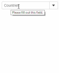
placeholder: 'Countries',
headerFormat: '{count:n0} countries',
displayMemberPath: 'country',
itemsSource: getData()
});
}