Button Columns in FlexGrid using CellMaker
We have an easy way to add Button Columns to our JavaScript DataGrid. In that last release, we added a cellTemplate property to the FlexGrid's Column class. This property allows developers to define custom content for cells using template literals, which provide a lot of flexibility.
In many cases, the cellTemplate is simpler and easier to use than the formatItem event. But some of our customers wanted something even more manageable, so they would not have to write any HTML if all they wanted to do was create some common simple cells like buttons and hyperlinks.
Let's look at how we can use CellMaker to add a Button column to FlexGrid. To create button columns, use the CellMaker class as follows:
 import { FlexGrid, ICellTemplateContext } from '@grapecity/wijmo.grid';
 import { CellMaker } from '@grapecity/wijmo.grid.cellmaker';

 let theGrid = new FlexGrid('#theGrid', {
     showMarquee: true,
     autoGenerateColumns: false,
     columns: [

         // button with fixed text
         {
             binding: 'country',
             header: 'Custom Button',
             width: 150,
             cellTemplate: CellMaker.makeButton({
                 text: '<b>${item.country}</b> Button',
                 click: (e, ctx) => {
                     alert('Clicked Button ' + ctx.item.country)
                 }
             })
         },
     ]
 });
The code sets the column's cellTemplate property to an ICellTemplateFunction provided by the CellMaker's makeButton method.
The makeButton method takes an options parameter that allows you to provide custom text for the button and a handler for the click event.
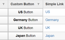
The result looks like this: