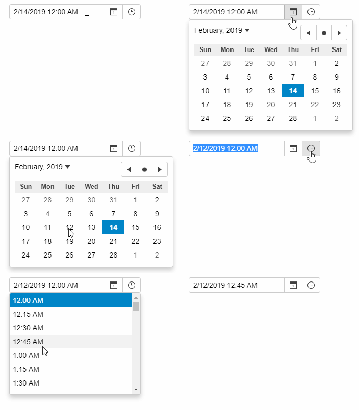
InputDateTime Overview
The InputDateTime control unifies InputDate and InputTime into a single control, saving some screen real-estate in scenarios where you do want to edit the date and time parts of a Date object. It allows users to input dates and times, either by typing complete date/time values in any format supported by the Globalize class, or by picking dates from the drop-down calendar and time from the drop-down list.
The InputDateTime control format property should be set to a format such as "g", which displays both date and time. It has two drop-down buttons, one for showing a calendar and another for list of times.
The InputDateTime control extends the InputDate, so all properties and events are available as usual. It adds following properties to control the time-specific parameters of the control:
- inputTime: Gets a reference to the inner InputTime control.
- timeMin, timeMax, timeStep: Get or set the parameters used to populate the list of times shown in the time drop-down.
- timeFormat: Gets or sets the format used to show time values in the InputTime drop-down.

HTML
<input id="theInputDateTime">
Javascript
import * as wijmo from '@grapecity/wijmo';
import * as input from '@grapecity/wijmo.input';

function init() {
    // edit date and time using an InputDateTime
    let theInputDateTime = new input.InputDateTime('#theInputDateTime');
}
