5.20231.904
5.20231.904
Tooltips in FlexChart
The FlexChart has built-in support for tooltips. By default, the control displays tooltips when the user touches or hovers the mouse on a data point.
The tooltip content is generated using a template, which may contain the following parameters:
- seriesName: The name of the series that contains the chart element.
- pointIndex: The index of the chart element within the series.
- x: The x value of the chart element.
- y: The y value of the chart element.
By default, the tooltip template is set to:
<b>{seriesName}</b><br/>{x} {y}
The tooltip content template supports bound fields from the data set:
myChart.tooltip: { content: "<b>{company}</b><br/>{sales:c2}"
The tooltip content template supports any HTML such as tables and images.
myChart.tooltip: { content: "<img src='resources/{x}.png'/> <b>{seriesName}</b><br/>{y}"
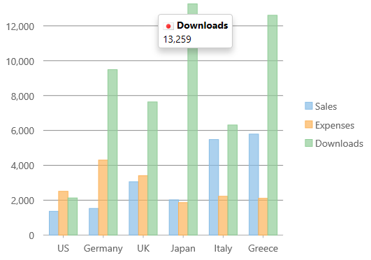
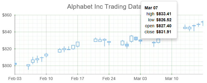
Table Tooltip Example
myChart.tooltip.content = '<b>{date:MMM dd}</b><br/>' +
          '<table>' +
            '<tr><td>high</td><td>{high:c}</td><tr/>' +
            '<tr><td>low</td><td>{low:c}</td><tr/>' +
            '<tr><td>open</td><td>{open:c}</td><tr/>' +
            '<tr><td>close</td><td>{close:c}</td><tr/>' +
        '</table>';
Disabling the Tooltip
You can disable the chart tooltips by setting the template to an empty string.
myChart.tooltip.content = '';
Styling the Tooltip
The tooltip content can be styled using rich html. You can adjust other settings like background, border and padding through CSS styles that can be applied to the .wj-tooltipclass.
.wj-tooltip {
  padding: 12px;
}