5.20231.904
5.20231.904
Axis Scaling in FlexChart
Use logarithmic axes to spread clustered data and improve the clarity of your charts without sacrificing accuracy. Use scaling formats to display axis labels in a clear and concise way.
- Use the axis logBase property to spread data that is clustered around the origin. This is common in several financial and economic data sets. If the base is not specified the axis uses a linear scale.
- Use the axis format property to automatically scale the labels and show thousands or millions instead of very large raw values.
import * as chart from '@grapecity/wijmo.chart';

// create the chart
var myChart = new chart.FlexChart('#myChart');
myChart.axisX.logBase = 10;
myChart.axisX.format = 'g4,,';
myChart.axisY.logBase = 10;
myChart.axisY.format = 'g4,';
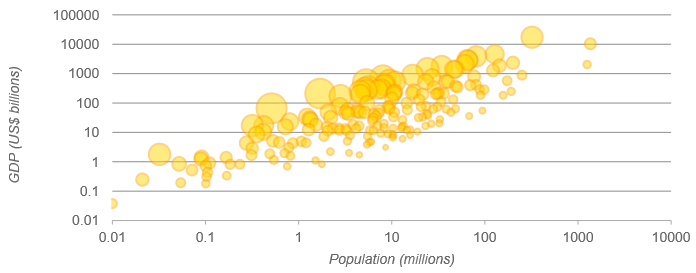
The bubble chart below shows the population (x), GDP (y), and per-capita income (bubble size) for about 200 countries. Notice how the use of log-axes spreads out the data and makes the chart easy to read.