5.20231.904
5.20231.904
InputMask Overview
The InputMask control allows you to validate and format user input as it is entered. The control prevents users from accidentally entering invalid data and saves time by skipping over literals (such as slashes in dates) as the user types.
The mask used to validate the input is defined by the mask property, which may contain one or more of the following special characters:
| Character | Mask Type |
|---|---|
| 0 | Digit. |
| 9 | Digit or space. |
| # | Digit, sign, or space. |
| L | Letter |
| l | Letter or space. |
| A | Alphanumeric. |
| a | Alphanumeric or space. |
| . | Localized decimal point. |
| , | Localized thousand separator. |
| : | Localized time separator. |
| / | Localized date separator. |
| $ | Localized currency symbol. |
| < | Converts characters that follow to lowercase. |
| > | Converts characters that follow to uppercase. |
| \ | Escapes any character, turning it into a literal. |
| 9 | DBCS Digit. |
| J | DBCS Hiragana. |
| G | DBCS big Hiragana. |
| K | DBCS Katakana. |
| N | DBCS big Katakana. |
| K | SBCS Katakana. |
| N | SBCS big Katakana. |
| Z | Any DBCS character. |
| H | Any SBCS character. |
| All others | Literals. |
The main properties of the control include:
- value: It returns the full text content of the control, including the user's input and any template characters.
- rawValue: In contrast to value property, you can use the rawValue property to get or set the control value including only the input characters and excluding any template characters.
- promptChar: By default, the InputMask control uses an underscore character to indicate positions where input is expected. You can change this by assigning a new string to the promptChar property. Refer to the Prompt Character demo for examples.
- maskFull: It indicates whether the mask has been completely filled. Refer to InputMask Validation demo for an example .
HTML
<input id="thePhone"><br>
Javascript
import * as input from '@grapecity/wijmo.input';
function init() {
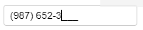
let thePhone = new input.InputMask('#thePhone', {
mask: '(999) 000-0000'
});
}