5.20231.904
5.20231.904
Funnel Charts with FlexChart
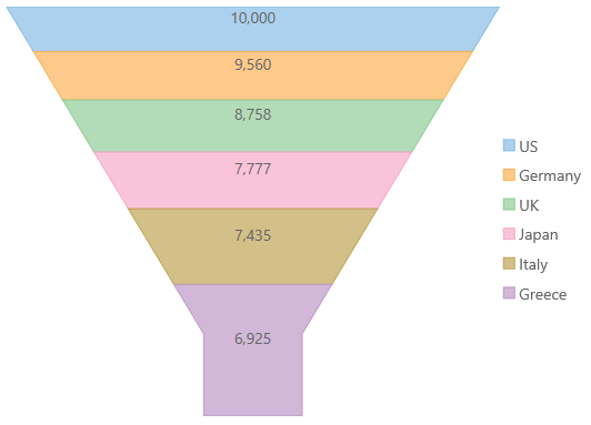
Funnel charts show values along multiple stages in a process. For example, you could use a funnel chart to show the number of sales prospects at each stage in a sales pipeline. Typically, the values decrease gradually, making the bars resemble a funnel. They can also be useful in identifying potential problem areas in an organization's sales processes.
To create funnel charts with the FlexChart control, set the bindingX property to the name of the property that contains the step along the pipeline, and add a single series with binding set to the amount of transactions at the given step.
You can adjust the funnel's height, width, and style using the options property.
- funnel.neckWidth: Specifies the neck width as a percentage for the Funnel chart. The default value is 0.2.
- funnel.neckHeight: Specifies the neck height as a percentage for the Funnel chart. The default value is 0.
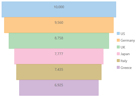
- funnel.type: Specifies the type of Funnel chart. It should be 'rectangle' or 'default'. neckWidth and neckHeight don't work if type is set to rectangle.
Example:
import * as chart from '@grapecity/wijmo.chart';

var myChart = new chart.FlexChart('#myChart', {
    chartType: wijmo.chart.ChartType.Funnel,
    bindingX: 'country',
    series: [
        { name: 'Sales', binding: 'sales' }
    ],
    dataLabel: { content: '{y}' },
    options: {
        funnel: {
            neckWidth: 0.2,
            neckHeight: 0.2,
            type: 'default'
        }
    }
});
The following is what the 'rectangle' funnel chart looks like.
myChart.options.funnel.type = 'rectangle';