5.20231.904
5.20231.904
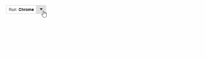
Menu as Split Buttons
Split Buttons allow users to select a value by clicking a primary button, or select from a list of mutually exclusive values displayed in a drop-down list.
To use Wijmo Menu controls as split buttons, all you have to do is set the isButton property to true. Once you do that, clicking the menu header will raise the itemClicked event instead of showing the drop-down list.
Example: The Menu control has been implemented as a SplitButton:
HTML
<div id="theSplitButton"></div>
Javascript
import * as input from '@grapecity/wijmo.input';

function init() {
    // create the split-button menu
    var theSplitButton = new input.Menu('#theSplitButton', {
        // item clicked fires when you select an option or click the header
        isButton: true,
        itemClicked: (sender) => {
            alert('Running ' + sender.selectedValue);
        },

        // update header to show current selection
        selectedIndexChanged: (sender) => {
            if (sender.selectedIndex > -1) {
                sender.header = `Run: <b>${sender.selectedItem.header}</b>`;
            }
        },

        // populate menu after hooking up the selectedIndexChanged event
        displayMemberPath: 'header',
        selectedValuePath: 'value',
        itemsSource: [
            { header: 'Internet Explorer', value: 'IE' },
            { header: 'Chrome', value: 'CHR' },
            { header: 'Firefox', value: 'FFX' },
            { header: 'Safari', value: 'IOS' },
            { header: 'Opera', value: 'OPR' }
        ],
        selectedValue: 'FFX'
    });
}