Sunburst
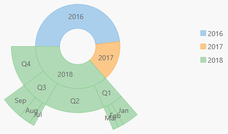
Use the wijmo.chart.hierarchical.Sunburst control to create sunbursts. This topic includes features specific to sunbursts. For common features such as data labels, export, palette and styling you can refer to the other topics within the chart module.
Getting Started with Wijmo Sunburst
Here are the steps for getting started with the Sunburst control in JavaScript applications:
- Add references to Wijmo.
- Add markup to serve as the Wijmo control's host.
- Initialize the Sunburst control via JavaScript.
HTML Example:
<div id="myChart"></div>
JavaScript Example:
import * as hierarchical from '@grapecity/wijmo.chart.hierarchical';

var myChart = new hierarchical.Sunburst('#myChart', {
    binding: 'value',
    bindingName: ['year', 'quarter', 'month'],
    itemsSource: getData(),
    dataLabel: {
        position: 'Center',
        content: '{name}'
    }
});
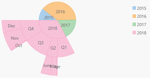
Sunburst Data Binding
The data binding for Sunburst is slightly different than FlexChart, and more similar to FlexPie.
The binding property is used to calculate the size of the node as compared to other node values. The property should contain numeric data.
The bindingName property is used to show name of the node. It should be an array or a string.
Using Grouped Data Sources
You can use the Sunburst chart with grouped CollectionView data sources. For example, if a CollectionView has two group descriptors: "category" and "subCategory", this can be bound to TreeMap using an array for the bindingName.
myChart.bindingName = ['category', 'subCategory'];
Sunburst Basic Settings
The Sunburst chart control has five basic properties that allow you to customize its layout and appearance:
- innerRadius: Specifies the control's inner radius to support donut charts.
- offset: Specifies the offset of the sunburst slices from the center of the control.
- startAngle: Starting at the nine o'clock position, specifies the angle to start drawing sunburst slices.
- palette: Specifies an array of default colors to be used when rendering sunburst slices.
- reversed: Determines whether the control should draw sunburst slices clockwise (false) or counterclockwise (true).
Example:
import * as hierarchical from '@grapecity/wijmo.chart.hierarchical';

var myChart = new hierarchical.Sunburst('#myChart', {
    binding: 'value',
    bindingName: 'year, quarter, month',
    itemsSource: getData(),
    innerRadius: 0.2,
    offset: 0,
    dataLabel: {
        position: 'Center',
        content: '{name}'
    }
});
Selection
The Sunburst control allows you to select data points by clicking or touching a pie slice. Use the selectionMode property to specify whether you want to allow selection by data point or no selection at all (default).
Setting the selctionMode property to Point causes the Sunburst to update the selection property when the user clicks on a pie slice, and to apply the "wj-state-selected" class to the selected element. Setting the chart's selectionMode property to Series or None will disable selections within the control.
Like FlexPie, Sunburst offers three additional properties to customize the selection:
- selectedItemOffset: Specifies the offset of the selected pie slice from the center of the control.
- selectedItemPosition: Specifies the position of the selected pie slice. The available options are Top, Bottom, Left, Right, and None (default).
- isAnimated: Determines whether or not to animate the selection.
Example:
myChart.isAnimated = true;
myChart.selectionMode = 'Point';
myChart.selectedItemOffset = 0.2;
myChart.selectedItemPosition = 'Top';
Sunburst Color Palette
The palette property determines the colors used in the chart. The array contains strings that represent CSS colors. For example:
// use colors specified by name
myChart.palette = ['red', 'green', 'blue'];

// or use colors specified as rgba-values
myChart.palette = [
  'rgba(255,0,0,1)',
  'rgba(255,0,0,0.8)',
  'rgba(255,0,0,0.6)',
  'rgba(255,0,0,0.4)'];
The Sunburst and TreeMap controls support a color range for each group. This allows each group to remain themed to a single color group.
myChart.palette = [
    { titleColor: '#00277d', maxColor: 'rgba(0,39,125,0.7)', minColor: 'rgba(168,187,230,0.7)' },
    { titleColor: '#7d1f00', maxColor: 'rgba(125,21,0,0.7)', minColor: 'rgba(230,183,168,0.7)' },
    { titleColor: '#007d27', maxColor: 'rgba(0,125,39,0.7)', minColor: 'rgba(168,230,188,0.7)' },
    { titleColor: '#7d003c', maxColor: 'rgba(125,0,60,0.7)', minColor: 'rgba(230,168,198,0.7)' },
    { titleColor: '#7d4300', maxColor: 'rgba(125,67,0,0.7)', minColor: 'rgba(230,201,168,0.7)' },
    { titleColor: '#51007d', maxColor: 'rgba(81,0,125,0.7)', minColor: 'rgba(209,170,230,0.7)' },
    { titleColor: '#7d7400', maxColor: 'rgba(125,116,0,0.7)', minColor: 'rgba(230,226,168,0.7)' },
    { titleColor: '#970000', maxColor: 'rgba(151,0,0,0.7)', minColor: 'rgba(230,169,169,0.7)' }
    ]
Styling Sunburst Using CSS
Alternatively to setting the palette, you can use CSS to style each level of the sunburst. The 'ellipse' class represents the center area.
.custom-sunburst-chart.wj-sunburst ellipse {
    fill: yellow;
}
.custom-sunburst-chart.wj-sunburst .slice-level2 > path {
    fill: red;
}
.custom-sunburst-chart.wj-sunburst .slice-level3 > path {
    fill: blue;
}
.custom-sunburst-chart.wj-sunburst .slice-level4 > path {
    fill: black;
}
.custom-sunburst-chart.wj-sunburst .slice-level5 > path {
    fill: white;
    stroke-width: 2;
    stroke: black;
}