5.20231.904
5.20231.904
PopUp With Owner Elements
Popups may have owner elements that control their position and visibility. The showTrigger and hideTrigger properties of the Popup control determine whether the Popup should be shown or hidden when the owner element is clicked or when the popup loses the focus.
In Bootstrap CSS, Popups with owner elements are called "Popovers". The most common type of Popover is the one with showTrigger set to 'Click' and hideTrigger set to 'Blur'.
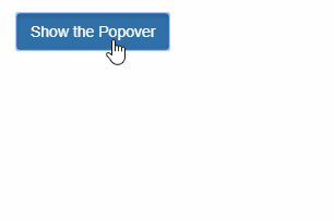
Example: The owner element is a button. Clicking the button will show the Popover. Clicking anywhere outside the Popover to take the focus away and it will hide the popup:
HTML
  <button id="btnClickBlur" class="btn btn-primary">
    Show the Popover
  </button>
  <div id="popClickBlur" class="popover">
    <h3 class="popover-title">
      Title
    </h3>
    <div class="popover-content">
      Hello Popup<br/>
      This is a multi-line message!
      This is a long line in my popover, which uses Bootstrap's
      'popover-content' style.
    </div>
  </div>
Javascript
import * as input from '@grapecity/wijmo.input';

function init() {
    let popClickBlur = new input.Popup('#popClickBlur', {
        owner: document.getElementById('btnClickBlur'),
        showTrigger: 'Click',
        hideTrigger: 'Blur'
    });
}