Basic Axis Settings in FlexChart
An axis is composed of several elements, such as labels, line, tick marks and titles. There are several properties available in FlexChart that let you customize these elements, for both X and Y axes.
Chart axes have two main purposes:
- scaling: Axes set the range of values shown on the chart. By default, this range is calculated automatically by the chart. The ranges are used even if the axes are hidden from view.
- context: Axes display tickmarks and labels that help identify the values being displayed (e.g. "what country and value does this bar represent?").
By default, the FlexChart uses horizontal lines to show the x-axis and major gridlines along the y-axis. This makes charts clean and easy-to-read. When you bind to a FlexChart the X and Y axes are generated automatically.
You can access the axis in code through the axisX and axisY properties. Some of the basic axis tasks are listed below.
Setting the Axis Title
The following is an example for setting the axis title.
import * as chart from '@grapecity/wijmo.chart';

var myChart = new chart.FlexChart('#myChart');
myChart.axisX.title = 'Axis X Title';
myChart.axisY.title = 'Axis Y Title';
Setting the Axis Range
When FlexChart is bound, the axes will automatically calculate the best range for the data set. Explicitly control the axis range by settting the min and max properties.
myChart.axisY.min = 150000;
myChart.axisY.max = 160000;
Reverse the Axis
By default, the X axis increments from left to right, and the Y axis increments from bottom to top. Revserse this direction for either axis by setting the reversed property.
myChart.axisY.reversed = true;
Axis Position & Origin
By default, the X axis is positioned at the bottom of the plot, an the Y axis is positioned at the left of the plot. You can position either axis at the opposite edge of the plot by setting the position property.
myChart.axisX.position = 'Top';
myChart.axisY.position = 'Right';
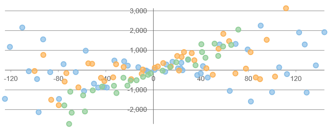
Additionally, configure where either axis intersects the other axis by setting the origin property. By default, the axes will intersect at the minimum values even if they are negative. Use the origin property to create a quadrant chart by forcing the axes to intersect at 0.
myChart.axisX.origin = 0;
myChart.axisY.origin = 0;
When you set origin, the position property can be used to determine which side of the axis line the ticks and labels will display.
Removing the Axes
You can remove the axes completely by setting their position property to 'None'. The result is the cleanest possible chart, with a high data-to-ink ratio.
myChart.axisX.position = 'None';
myChart.axisY.position = 'None';
The 'None' position also hides the gridlines. To hide just the axis line, title and labels but keep the gridlines, set the axisLine, labels, and title properties separately.
Example:
// hide the X axis line, labels and title
myChart.axisX.axisLine = false;
myChart.axisX.labels = false;
myChart.axisX.title = '';