5.20231.904
5.20231.904
Chart Types
The FlexChart control has three properties that allow you to customize the chart type:
- chartType: Selects the default chart type to be used for all the series. Individual series may override this setting to combine multiple chart types.
- stacking: Determines whether series are plotted independently, stacked, or stacked so their sum is 100%.
- rotated: Flips the X and Y axes so X becomes vertical and Y horizontal.
Example:
import * as wjChart from '@grapecity/wijmo.chart';

  var myChart = new wjChart.FlexChart('#myChart', {
    chartType: 'Area',
    stacking: 'Stacked',
    rotated: true
  });
FlexChart supports the following Cartesian chart types:
- Column: Shows vertical bars and allows you to compare values of items across categories. Use this chart type for range columns as well.
- Bar: Shows horizontal bars. Use this chart type for range bars as well.
- Scatter: Shows patterns within the data using X and Y coordinates.
- Line: Shows trends over a period of time or across categories.
- LineSymbols: Shows a line chart with a symbol on each data point.
- Area: Shows a line chart with the area below the line filled with color.
- Bubble: Shows a scatter chart with a third data value that determines the size of the symbol.
- Candlestick: Presents items with high, low, open, and close values. The size of the wick line is determined by the High and Low values, while the size of the bar is determined by the Open and Close values. The bar is displayed using different colors, depending on whether the close value is higher or lower than the open value.
- HighLowOpenClose: Displays the same information as a candlestick chart, except that opening values are displayed using lines to the left, while lines to the right indicate closing values.
- Spline: Displays a line chart that plots curves rather than angled lines through the data points.
- SplineSymbols: Displays a spline chart with symbols on each data point.
- SplineArea: Displays a spline chart with the area below the line filled with color.
- Funnel: Displays a funnel chart, usually representing stages in a process such as a sales pipeline.
FlexChart supports the following stacking options:
- Stacked: Stacked charts show how each value contributes to the total.
- Stacked100pc: 100% stacked charts show how each value contributes to the total with relative size of each series representing its contribution to the total.
- None: No stacking. Each series object is plotted independently.
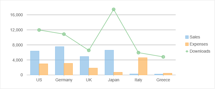
Combining Chart Types
Each series object in the FlexChart may specify its own chartType to override the chart's default. This makes it easy to combine different chart types in a single chart. Any series that does not have a chart type set will use the parent chart type.
import * as wjChart from '@grapecity/wijmo.chart';

var myChart = new wjChart.FlexChart('#myChart', {
    chartType: 'Column',
    bindingX: 'Country',
    series: [
        { name: 'Sales', binding: 'Sales' },
        { name: 'Expenses', binding: 'Expenses' },
        { name: 'Downloads', binding: 'Downloads', chartType: 'LineSymbols',  }
    ]
  });
Other Chart Types
Additional chart types are supported in other controls such as FlexPie and FlexRadar. You will find additional topics related to these controls under Advanced Concepts\Special Chart Types.
- FinancialChart: Specialized financial chart control with additional financial chart types (HeikinAshi, LineBreak, Renko, Kagi, ColumnVolume, EquiVolume, CandleVolume, ArmsCandleVolume, PointAndFigure). For more details, see Financial Charts.
- FlexPie: The FlexPie control provides pie and doughnut charts with selectable slices. For more details, see Pie & Donut Charts.
- FlexRadar: A radial chart control used for creating radar and polar charts (Column, Scatter, Line, LineSymbols, Area). For more details, see Radar & Polar Charts.
- Sunburst: Sunburst chart control. For more details, see Sunburst.
- TreeMap: The TreeMap control displays hierarchical (tree-structured) data as a set of nested rectangles. For more details, see TreeMap.
- Range Bar & Column: FlexChart Column and Bar chart types can also be used to display range column and bar charts. For more details, see Range Bar & Column Charts.