Gauge Styling & CSS
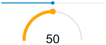
Unlike many gauge controls, Wijmo gauges concentrate on the data being displayed, with little extraneous color and markup elements. They were designed to be easy to use and to read, especially on small-screen devices.
The appearance of the gauge controls is primarily defined in CSS. To customize it, copy the CSS rules from the default theme to a new CSS file and modify them as needed.
.wj-gauge {
  width: 70%;
  margin: 20px auto;
}
.wj-gauge .wj-ticks {
  stroke: f0f0f0;
  stroke-width: 2px;
}
.wj-gauge .wj-face path {
  fill: #f0f0f0;
  stroke: #e0e0e0;
}
.wj-gauge.wj-state-focused circle.wj-pointer {
  stroke-width: 8px;
  stroke: currentColor;
}
Gauge Hover Styling
You can use the standard ":hover" pseudo-class to add special effects to gauges when the mouse moves over them.
.wj-gauge:hover .wj-pointer {
  fill: orange;
  stroke: orange;
  stroke-width: 4px;
  transition: fill stroke stroke-width .3s;
}
Gauge Focus Styling
You can use the "wj-state-focused" pseudo-class to add special effects to gauges when they contain the focus.
.wj-gauge.wj-state-focused .wj-pointer {
  fill: red;
}
.wj-gauge.wj-state-focused circle.wj-pointer {
  stroke-width: 4px;
  stroke: red;
}
Styling the Ranges
The color and position of the ranges is primarily defined by the value of the 'showRanges' and 'ranges' properties. But you can also control the overall style attributes of the ranges to apply a hover style.
.wj-gauge .wj-ranges {
  opacity: .25;
}
.wj-gauge:hover .wj-ranges {
  opacity: 1;
  transition: opacity 600ms;
}
Styling the Tickmarks
In addition to setting the tickmark color, the width (or thickness) of the tickmarks can be controlled by CSS.
.wj-gauge .wj-ticks {
  stroke: white;
  stroke-width: 2px;
}