FlexChart Styling & CSS
The FlexChart automatically picks colors for each series based on a default palette, which you can override by setting the palette property.
You can specify a pre-defined palette for FlexChart, FlexPie, and FlexRadar using the Palettes class:
myChart.palette = wijmo.chart.Palettes.light;
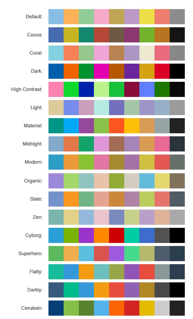
The following palettes are pre-defined:
- standard (default)
- cocoa
- coral
- dark
- highcontrast
- light
- midnight
- modern
- organic
- slate
- zen
- cyborg
- superhero
- flatly
- darkly
- cerulan
You can customize these colors, and modify the opacity levels of each series, by providing a custom palette. If the chart series require more colors they will repeat automatically.
// use colors specified by name
myChart.palette = ['red', 'green', 'blue'];

// or use colors specified as rgba-values
myChart.palette = [
  'rgba(255,0,0,1)',
  'rgba(255,0,0,0.8)',
  'rgba(255,0,0,0.6)',
  'rgba(255,0,0,0.4)'];
Styling Series
You can also override the default style settings for each series by setting the style and symbolStyle properties of any series to an object that specifies SVG styling attributes, including fill, stroke, strokeWidth, and so on.
The style properties are an exception to the general rule that all styling in Wijmo is done through CSS. This is because many charts have dynamic series, which would be impossible to style in advance.
myChart.series[0].style = {
    fill:'green',
    stroke:'darkgreen',
    strokeWidth: 1};

myChart.series[0].symbolStyle = {
    fill:'red',
    stroke:'darkred',
    strokeWidth: 2};
Using CSS
Like all Wijmo controls, FlexChart adds well-known class names to elements in its DOM tree. These class names allow you to define CSS rules that customize the appearance of each chart element.
To customize the appearance of the chart, inspect the elements you want to style and then create some CSS rules that apply to those elements.
For example, if you right-click one of the labels on the X axis in Edge or Chrome, you will see that it is an element with the "wj-label" class, that is contained in an element with the "wj-axis-x" class, which is contained in the the top-level control element that has the "wj-flexchart" class. The first CSS rule in this example uses this information to customize the X labels. The rule selector adds the additional requirement that the parent element must have, the "wj-flexchart" and the "custom-flex-chart" classes. Without this, the rule would apply to all the charts on the page.
Custom chart theme CSS example:
/* custom chart theme CSS */
.custom-chart {
  background: #efefef;
  background: linear-gradient(to bottom right, rgba(255,255,255,1) 0%, rgba(246,246,246,1) 47%, rgba(237,237,237,1) 100%);
  box-shadow: 4px 4px 10px 0px rgba(50, 50, 50, 0.75);
  padding: 8px;
 }
.custom-chart .wj-label {
  font-family: Courier New, Courier, monospace;
  font-weight: bold;
}
.custom-chart .wj-legend .wj-label {
  font-family: Courier New, Courier, monospace;
  font-weight: bold;
}
.custom-chart .wj-legend > rect {
  fill: #f8f8f8;
  stroke: #c0c0c0;
}
.custom-chart .wj-plot-area > rect {
  fill: white;
  stroke: #c0c0c0;
}
Set the class on the chart div to set the custom theme.
<div id="myChart" class="custom-chart"></div>
Additional Style Topics
For more details on styling specific chart elements, see the following topics: