TransposedMultiRow Layout Definition
The TransposedMultiRow control extends the FlexGrid control to display data using a transposed layout, where columns represent data items and rows represent item properties like in the TransposedGrid control.
But in contrast to the TransposedGrid control, the TransposedMultiRow control uses multiple columns to represent each data item. It makes possible to create form-like interfaces that can display a large number of rows with minimal vertical scrolling.
Like the MultiRow control, the TransposedMultiRow control also allows to customize layout using the property layoutDefinition. This property has the same meaning and usage as in the MultiRow control although the resulting view will looks differently because of transposing.
The layoutDefinition property specifies the layout of the cells in the grid. It contains an array of cell group objects. Each cell group specifies how many columns the group should span, and the cells that make up each group.
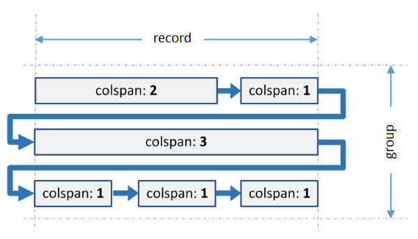
The image below illustrates how a cell group is interpreted and turned into a grid layout:
 The group spans three grid columns. It contains six cells with different spans. When generating the layout, the grid fits as many cells as possible in each row, and wraps to the next row when the group span is reached. The last cell in each row is automatically expanded to fill colspan of the group. The process is similar to wrapping of text to create a paragraph.
The same process is applied to every group in the layoutDefinition object.
When all groups are ready, the grid calculates the number of columns per record to the maximum colspan of all groups, and adds columns to each group to pad their width as needed. As a result, each record has the same number of columns. It is the only difference from the MultiRow control where each record has the same number of rows.
Code Example
import { TransposedMultiRow } from '@grapecity/wijmo.grid.transposedmultirow';

var multirow = new TransposedMultiRow('#trnMultirow', {
    itemsSource: appData.orders,
    layoutDefinition: [
        {
            header: 'Order', colspan: 3, cells: [
                { binding: 'id', header: 'ID', rowspan: 2, cssClass: 'id' },
                { binding: 'amount', header: 'Amount', format: 'c', rowspan: 2, cssClass: 'amount' },
                { binding: 'date', header: 'Ordered' },
                { binding: 'shippedDate', header: 'Shipped' }
            ]
        },
        {
            header: 'Customer', colspan: 3, cells: [
                { binding: 'customer.name', header: 'Name' },
                { binding: 'customer.address', header: 'Address', rowspan: 2 },
                { binding: 'customer.city', header: 'City', dataMap: cityMap },
                { binding: 'customer.email', header: 'EMail', rowspan: 2, cssClass: 'email' },
                { binding: 'customer.state', header: 'State', width: 45 },
                { binding: 'customer.phone', header: 'Phone' },
                { binding: 'customer.zip', header: 'Zip' },
            ]
        },
        {
            header: 'Shipper', colspan: 3, cells: [
                { binding: 'shipper.name', header: 'Shipper' },
                { binding: 'shipper.email', header: 'EMail', cssClass: 'email' },
                { binding: 'shipper.express', header: 'Express' }
            ]
        }
    ]
});
Please note that the cells support all the usual Column properties except the width property. This property can be specified in the layoutDefinition object but the grid will ignore it because it is supposed that the cells in each rows should have the same width.
