Reference Sample Explorer
Geo Dashboard
Framework:
angular
react
vue
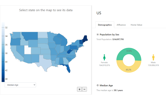
Sample creates a demographics dashboard using various wijmo data visualization controls,
including FlexChart, FlexMap, FlexPie, LinearGauge, BulletGraph.
You can select state on the map and see its detailed data visualized and presented in the multiple tiles.
Drop-down menu below the map allows to select a variable and see color-encoded map (choropleth).
The sample uses public demographics data from U.S. Census Bureau.
