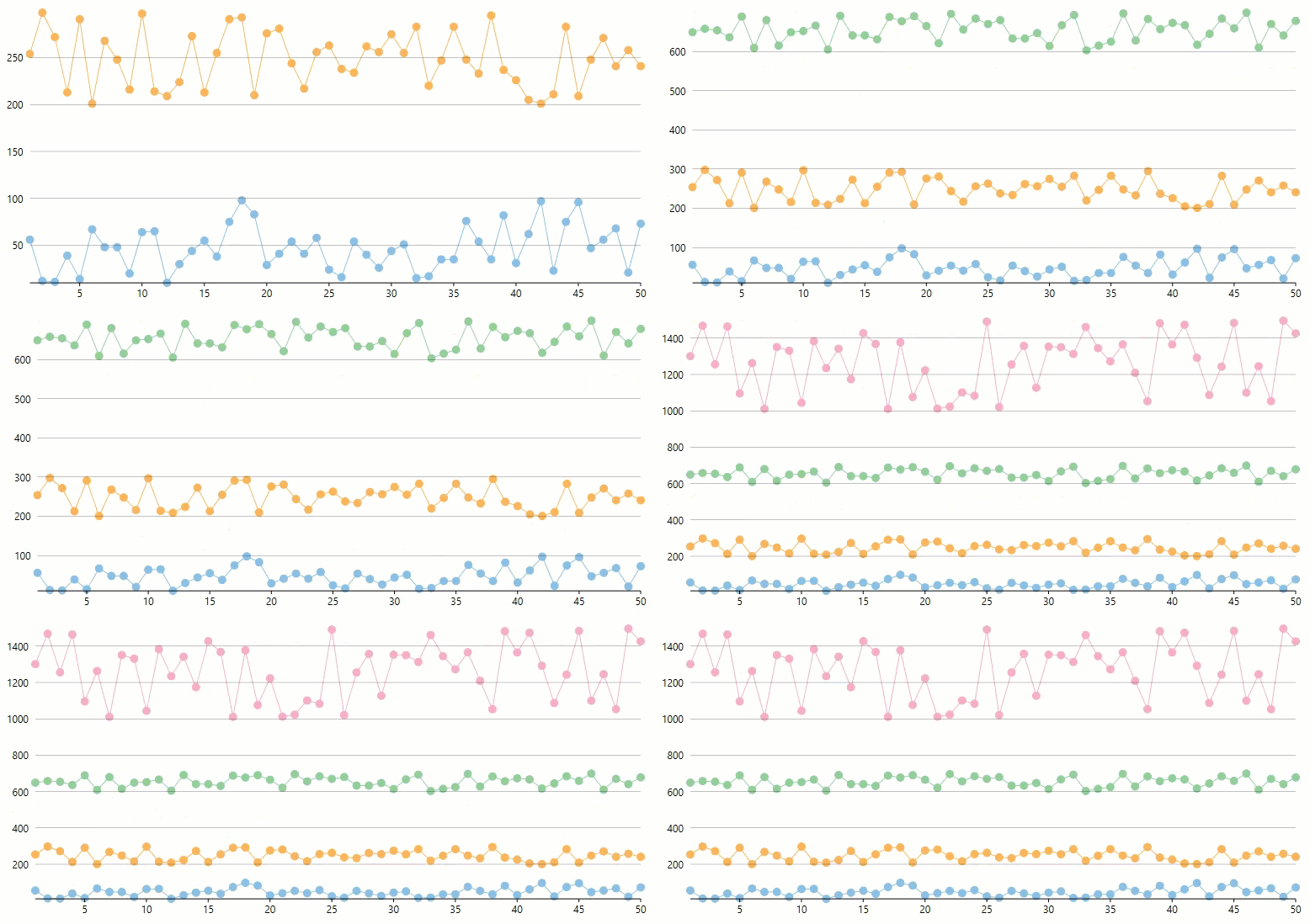
Sometimes, you require distinguishing the data plotted by the series in the chart. The need arises when the data points of the series do not fall in the same range. In other words, the Y axis of the series contain values in different ranges. For instance, there could be two series. The Y values for one might lie between 0 and 100 and that for the other between 0 and -100. In addition, the data of the series could require different scales altogether.
In such cases, displaying the Y values of the series on a single Y-axis can confuse the interpretation of the data and overlap the same as well. FlexChart automatically scales the axes to avoid this situation and represents data in a better way.
The GIF below displays axis scaling of different data series in FlexChart.

The code snippet below can be used to bind and add two series in FlexChart. Using the smiliar code, you can add more series to the FlexChart as shown in the above GIF.